Youngho Jung
Creative strategist, ad maker, Claude AI tinkerer, and marketing designer.
› Worked with LG Electronics, BMW Mini, and Lotteria.
› Grew my own Shopify store at 2.4x ROAS, $9K profit/month.
› Ex-growth marketer at Y-Combinator startup. Hit $0.9 per lead with paid ads.
› Helped a startup close $80K seed funding with pitch deck design.
I know what makes people click and buy. :)
DTC
Concept work. Analyzed real running ads and redesigned for higher conversion.
Before
After

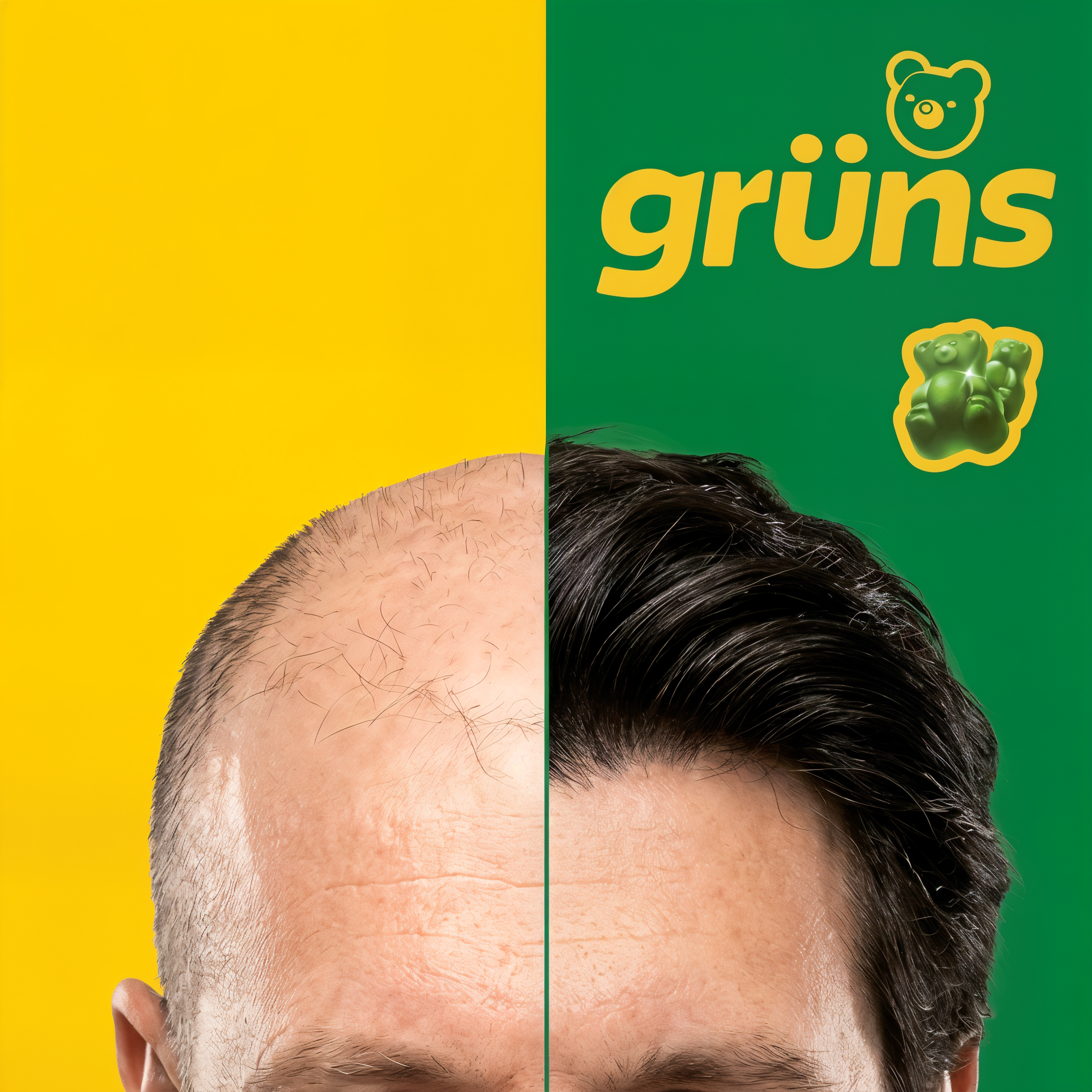
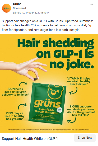
gruns.co
Austin, TX
•••
4,672 likes
gruns.co GLP-1 is tough. Get Gruns. #gruns #glp1 #hairgrowth
3 DAYS AGO
Before
After
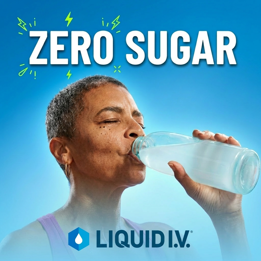
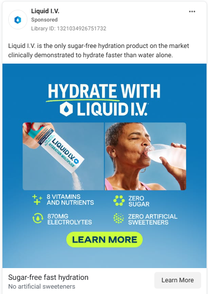
liquid_iv
Los Angeles, CA
•••
12,305 likes
liquid_iv All the hydration. Zero sugar. Finally. #liquidiv #sugarfree #hydration
5 HOURS AGO
Before
After
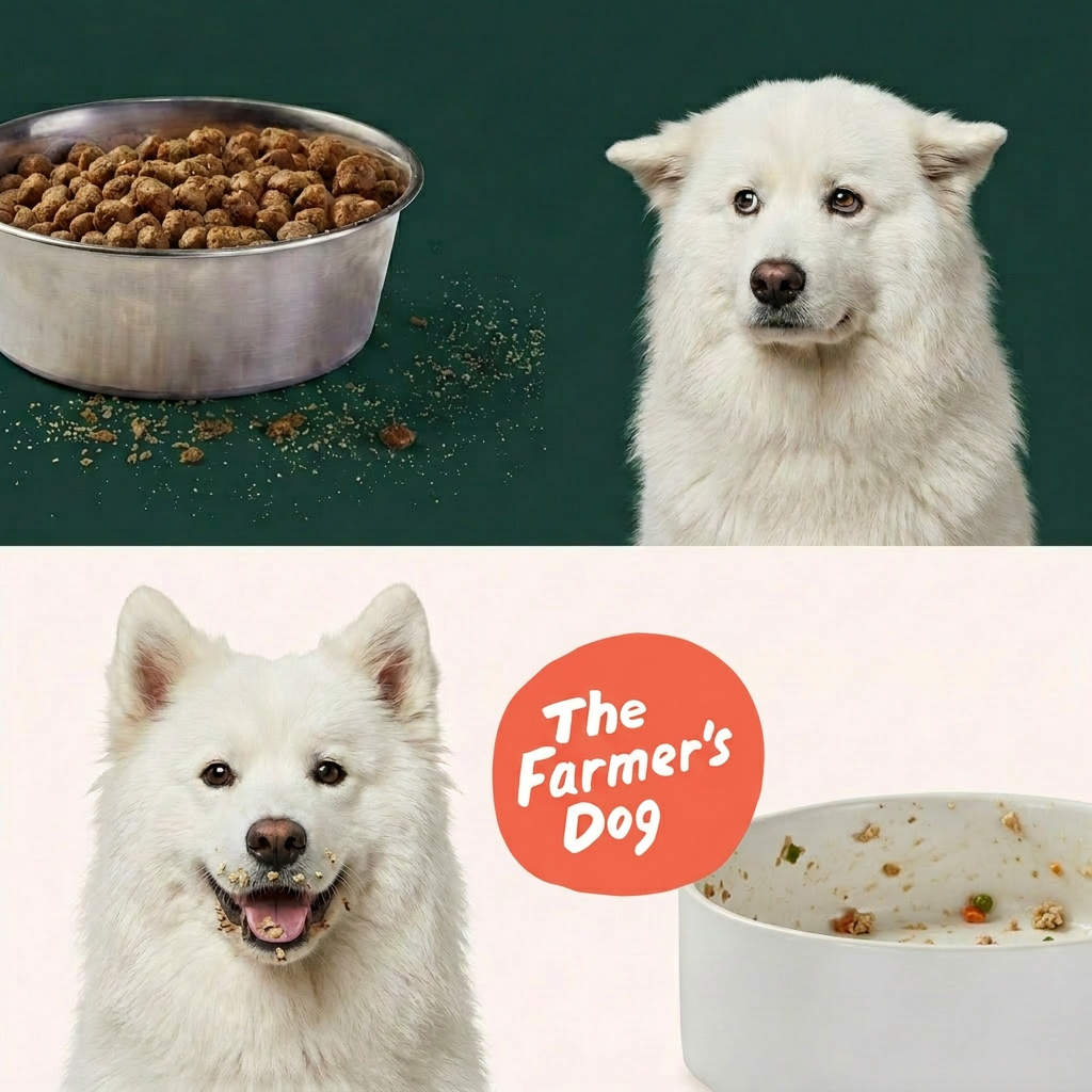
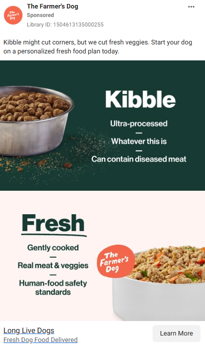
thefarmersdog
Brooklyn, NY
•••
31,088 likes
thefarmersdog Obviously, Cloud enjoyed the Farmer's Dog more than ultra-processed kibble. Grab one for your good boy today 🐶 #farmersdog #dogsofinstagram #realfood
1 DAY AGO
Before
After
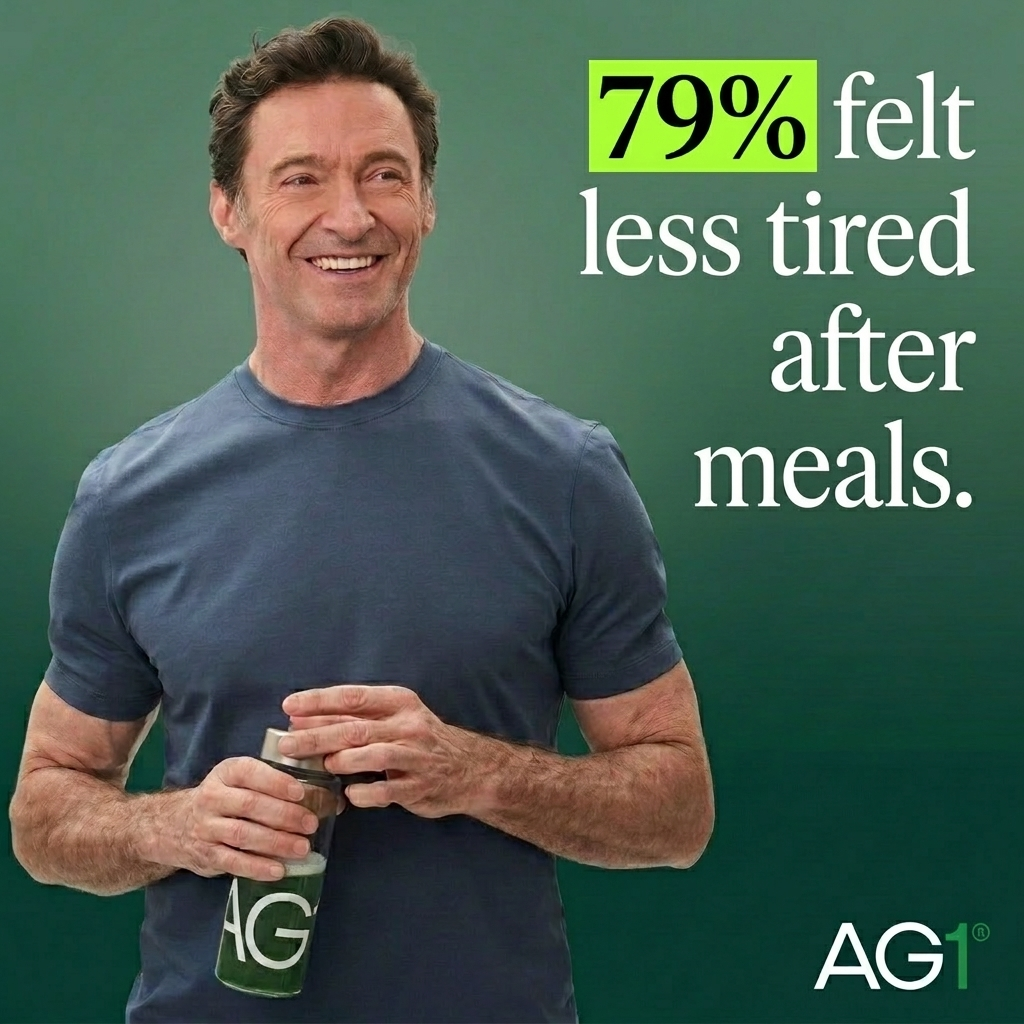
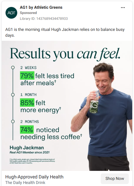
ag1drink
New York, NY
•••
8,421 likes
ag1drink Hugh Jackman's morning starts with one delicious scoop. Feel the results in 2 weeks. #ag1 #morningroutine #hughjackman
2 HOURS AGO
Before
After
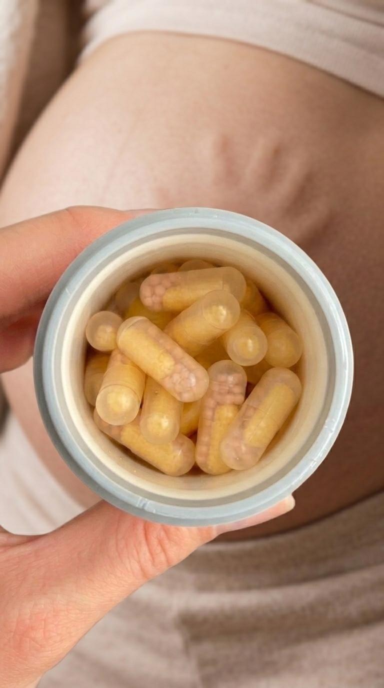
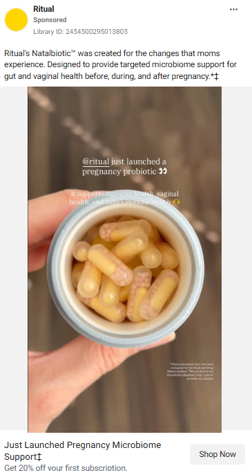
ritual
3h
•••
✕
ENTERPRISE
Large-scale ad production for digital billboards and retail displays.
.png)
.png)
.png)
Challenge
- Partnered with LG Electronics to explore what AI-generated creative could unlock for product and interior advertising.
- Delivered a proof of concept using custom LoRA fine-tuning and AI image models across 3D product and lifestyle visuals.
Impact
- The project became the team's largest contract — contributing 20% of annual revenue.
- Final assets were adopted by LG ad team's internal AI task force for employee training and AI adoption initiatives.
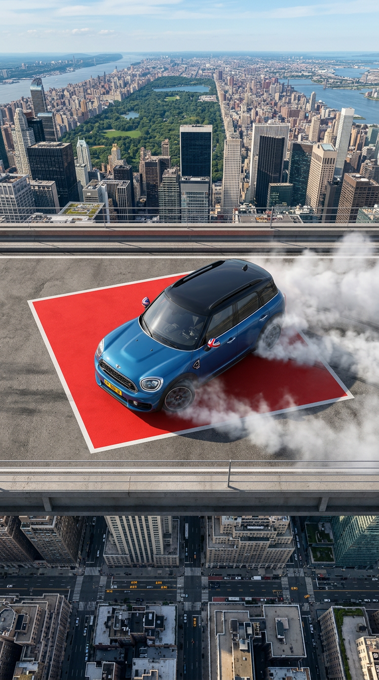
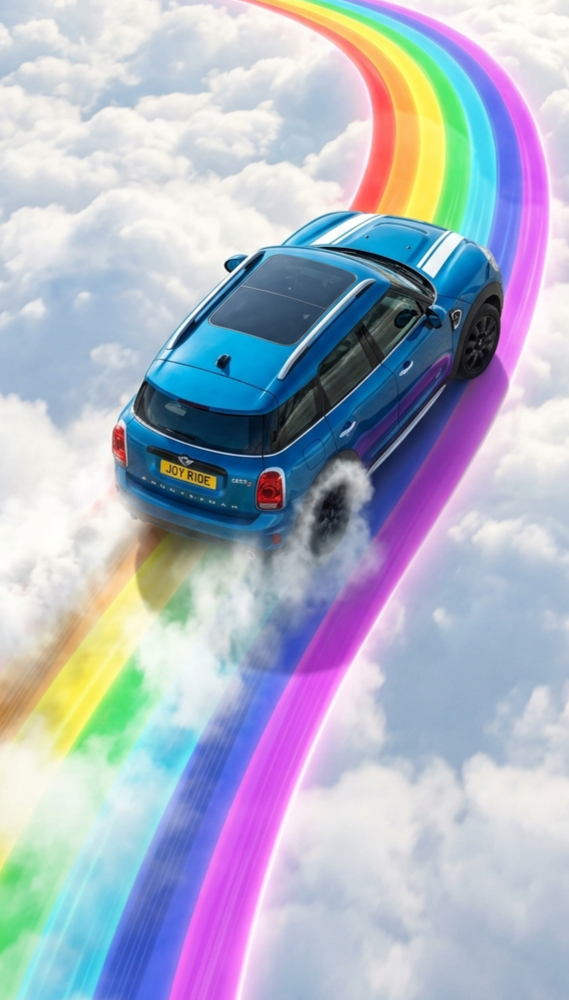
- Produced a co-branded promotional video for BMW Mini and Samsung Card's new checkcard launch.
- Delivered in under 3 weeks — fast turnaround for an enterprise co-branded campaign.
- One of the first AI-generated ad productions between BMW Mini and Samsung Card team.
*Due to NDA, visuals shown are representative of the actual work.
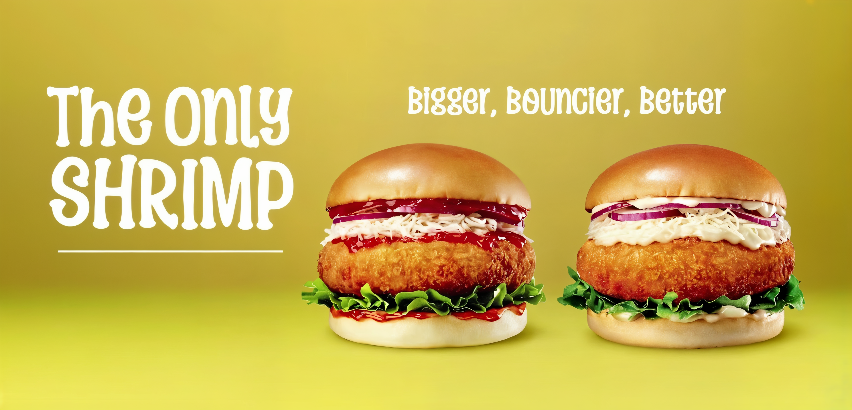
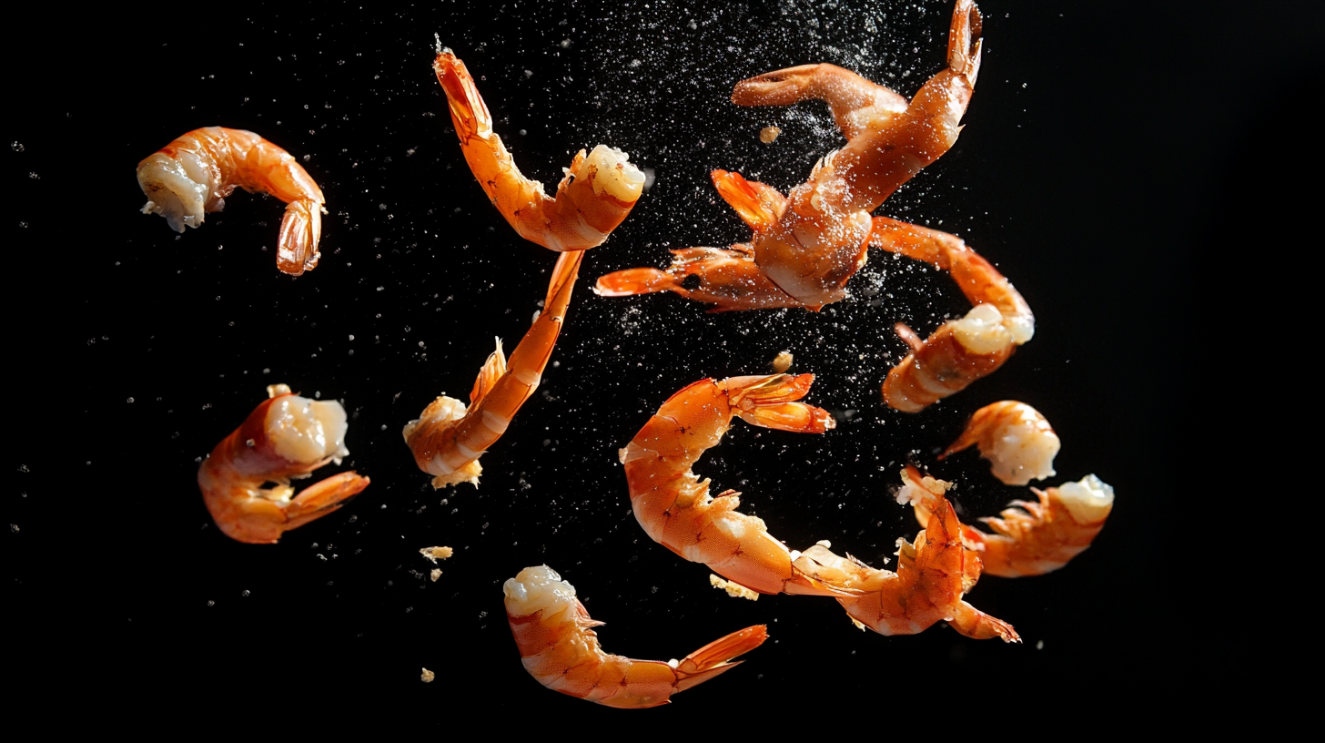
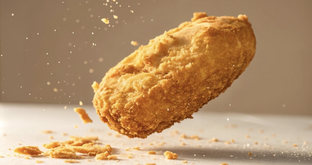

From kitchen recipe photos to Seoul's biggest skyscraper.
Challenge
- South Korea's largest hamburger chain needed a launch campaign fast.
- Traditional food ad production requires crew, studio rental, lighting, and multiple shoot days.
- The team had no time for a full production crew. Zero existing campaign assets. Only kitchen recipe photos from product development.
Impact
- Analyzed every reference image and recreated the entire burger lineup using AI — making raw recipe photos look like commercial-grade food advertising. No studio. No camera crew. No food stylists.
- The result went live on the largest building in Seoul.
- Delivered faster, cheaper, and entirely through AI workflow — without a single real product photo in the final output.